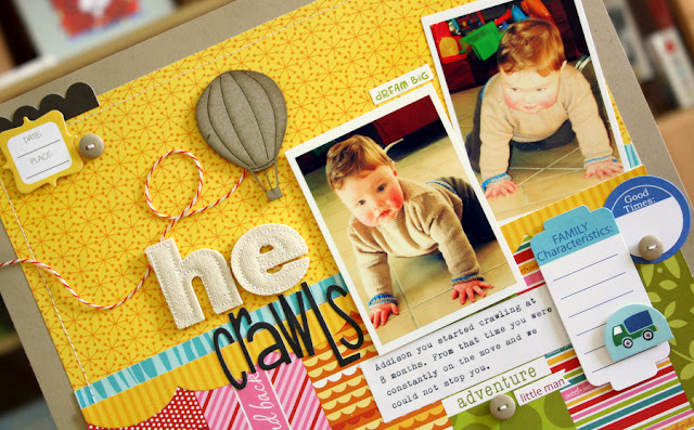
Using some older photos of my eldest when he started to crawl for this months inspiration challenge at Get Picky!
We had this gorgeous Summery photo as inspiration as well as the added criteria of using fabric on the page some where, in my case I have used some Prima canvas letters.
Hop on over to the Get Picky blog to see the other DT members inspiration and all the details of how to enter for a fabulous prize. I hope you will play along.
Before I go I wanted to announce the winner of my give away from The Get Picky birthday Blog Hop...
Jessica if you can email me at kimtoms2000at yahoo dot com dot au(no spaces of course) and I will get your goodies off to you asap, thankyou to everyone who entered!
Till next time...


28 comments:
Loved your page when I saw it Kim. You have mixed the bold colors together perfectly and cute pics, and the rosey red cheeks too.
Love these bright colors and photos of your eldest son :)
Woohoo - a bit of pink there I see! Love it, an also the cheeky photo of your #1 son :)
This is gorgeous, love your color choices too :)
Love all of this Kim. Love your colour combo & those pics, what can I say, he is soooo cute. Cheers Di xx
I love this page. It's so bright, colourful and alive.
Those pics are adorable! Great page! Fun design!
You have totally rocked these summery colours Kim! I just love it!
OH! WOWZERS KIM...
Just love your layout.........
The brightness really POPS here!!!
& What a GR8 milestone to document.....
Those pic's are just too CUTE!!!!
xx
oh my look at those chubbly cheeks ;). Such gorgeous use of colour. Love it :).
LOVE those cheeks :)
Adorable layout!!!!!!! I could see myself using these papers now!
oh Kim... this is so divine ... and those pics are the best !!!!! I could look at them forever ... such a little cutie ... fabulous page as always .. love it .. hugz x
oh my ! such adorable pics ! fabulous layout as always , hun !
What a cute little giveaway assistant you have! That smile just makes me smile!! Lovely LO and so cute to see photos of your oldest as a little baby. What a sweetie he is! :) I really like the design of your LO. Love the vertical strips at the bottom!
WOW!!!!! I so love your page! The colours are just amazing!
adorable! I love your take on the sketch!!
Gorgeous page Kim! Love all the bright colours and paper mixes! :))xx
OMG he was just the cutest at that age! Those adorable cheeks - LOVE your bright page - always a HUGE fan of color!
I just love your page Kim...I love the photos and all the details in there are gorgeus, so colorful!!!
I just love to came in here and see what you have done, so many wonderful work for inpired us.
Have a wonderful week.
Kisses and huges
Cynthia
Stunning page Kim! I love how clean and graphic your layouts are - with also so much to look at (if that makes sense!). Absolutely gorgeous! :D
Love your layout Kim! The mix of papers and colours are awesome. xx
Just gorgeous Kim. Love the burst of colours and wonderful textures! Visually arresting I must say! :)
Fantastic to scrap old photos, isn't it? Like your strips of pp/borders at the bottom and the yellow pp is just as fantastic as the last time you used it!
Outstanding layout girl - just pinned it to Pinterest!
i LOOOOVE the bright colors and mix of patterns and could your boys be any cuter??!!
I felt so inspired when I saw your layout on the Get Picky blog, just love how you have used the mix of colours, gorgeous x
These pages are so beautiful. Your work is so inspiring.
Post a Comment