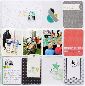
I wanted to create a cohesive look to my spread so I grabbed some of the dark blue , white and green 3x4 and 4x6 cards from the Core Kit then added in a small splash of red to make my spread pop!
I wanted the photos to be the highlight so I kept the embellishments to a minimum and let the bold fonts and words on the cards express the feelings and thoughts.
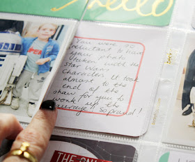
To add some extra journaling I folded a 4x6 card in half and adhered my photo on top. I then adhered the back of the card to the top of the plastic sleeve so i could open and close the card to add my journaling.
On the right side I added in some clear elements, that clear ampersand from the Value kit and the clear hello word from the embellishments in the kit.
My favourite way to attach clear elements is with my Tiny Attacher. It adds a subtle touch of texture to any layout without the bulk.
I do adore this kit so much and to celebrate ....
here's a printable .pdf with all of the supplies and directions you need to create the first page in this spread! Just click "download" link below the image!
Thanks for dropping by!


This looks lovely, great photos and memories.. the embellishments look wonderful!
ReplyDeleteLooks fabulous....& yup to the stapler idea for vellum etc. Works a treat! You've just reminded me I'd better start sorting out September pages for my PL!!!
ReplyDelete